Creative Work
Sterling Steel
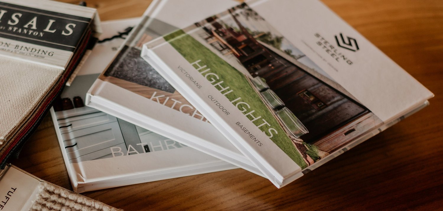
Sterling Steel is a boutique construction company located in Denver, Colorado. It focuses on luxury home renovations and new construction with an emphasis on design as a necessary component of the planning process. Our work for them can be broken into two parts: creative work on the brand and strategic thinking for the marketing of the construction company and the creation of its lifestyle blog, Steel Rising, which is discussed here.
Sterling Steel Website
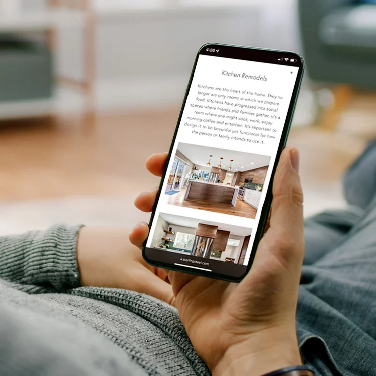
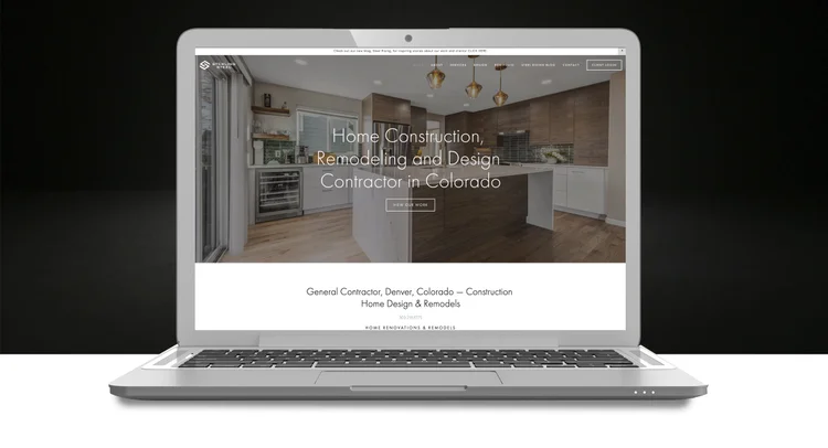
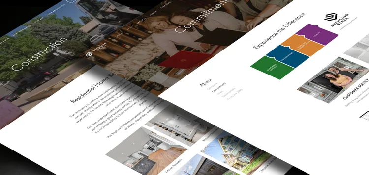
When the company was formed, all it had in existence from a branding perspective was a logo. It needed an upscale online presence to parallel its target clientele. As with any brand, a web site is often a customer’s first experience with a company. And because Sterling Steel was a service related industry without a store front, this was particularly true for them.
We developed a site that was easy to navigate, highly visual and allowed potential customers to quickly view what this construction company had to offer.
The company name has since changed to Abri Builders. We currently manage all the creative for their new branding and website as well and can be viewed at the link below.
Social Media & Digital Campaigns
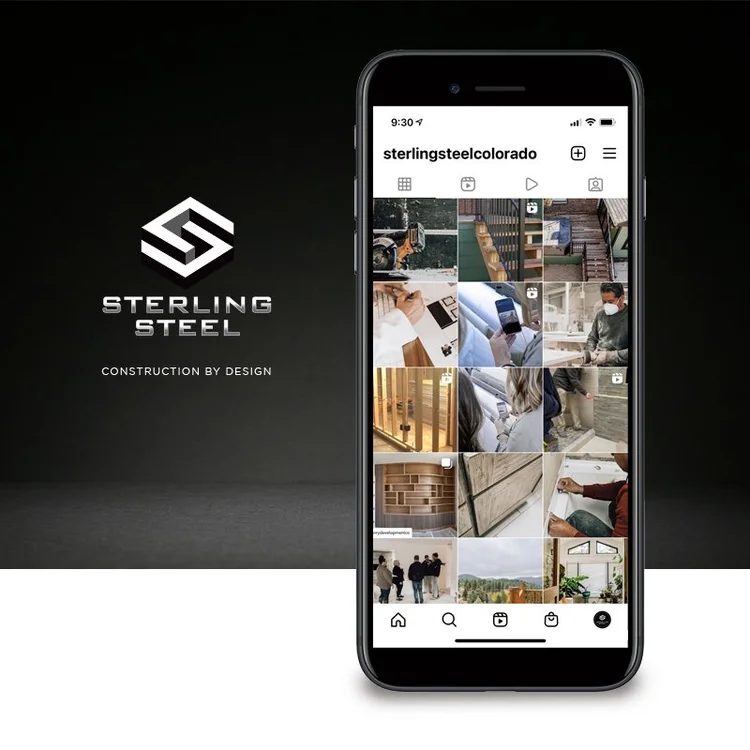
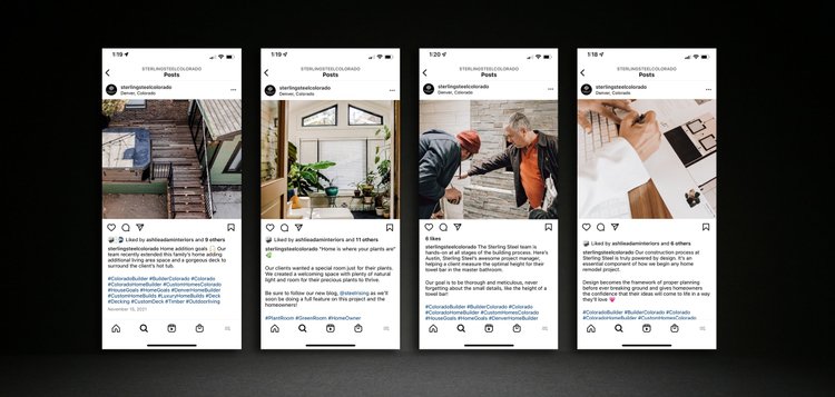
A social media plan was implemented to further visually illustrate the brand and tell potential clients the construction team’s story. The goal was to create engaging content that gave Sterling Steel relevance as a construction leader in the Denver market. We executed all copywriting and media creation in the social media planning which included video production, reels and cohesive brand imagery. Sterling Steel was heavily focused on building its Instagram presence, but this messaging was implemented across all of their social media platforms: Facebook, YouTube, Pinterest, Google, etc.
Video Production & Creative Direction
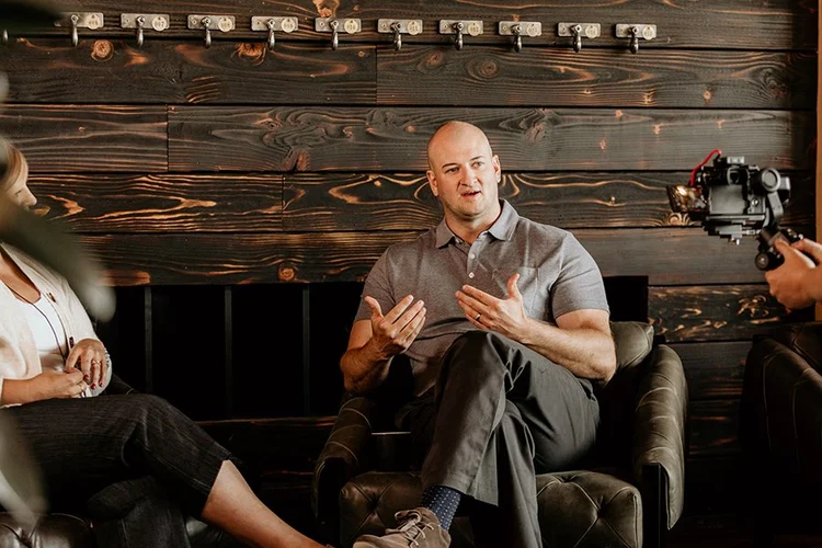
In 2021, filming and video production was prioritized to tell the story of the company. Below is the final cut of the Meet the Company we did for Sterling Steel. We directed these videos from a creative perspective creating filming schedules and bringing in videographers, photographers, props and make-up artists.
Digital Ads & Content for Social Media
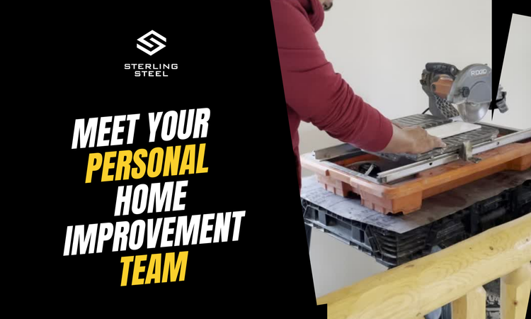
Directing the creative strategy of professional video intended as social media content was essential in building Sterling Steel’s Instagram following and driving traffic (and customers) to their web site. In addition to IG Reels, we created multiple digital ads to run on Facebook promoting the services of the construction team.
Marketing & Print Collateral
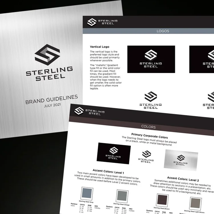
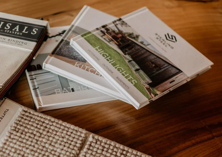
Various print collateral was designed for Sterling Steel all keeping in line with the established brand image: portfolio look books, lawn signage, and business cards to name a few. A brand guidelines document was also created to ensure the integrity of the brand and guide vendors and employees on how to use branding in their communications.
Snow Bowl
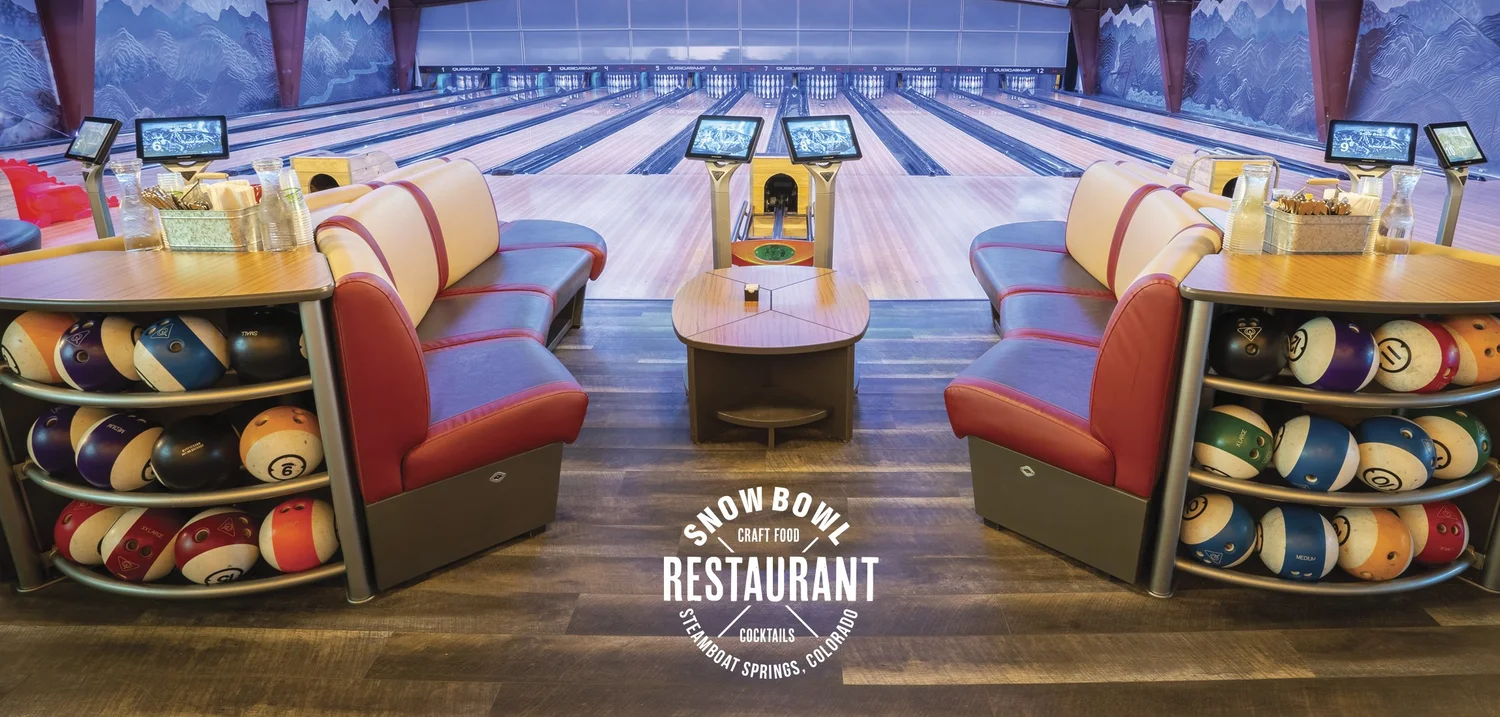
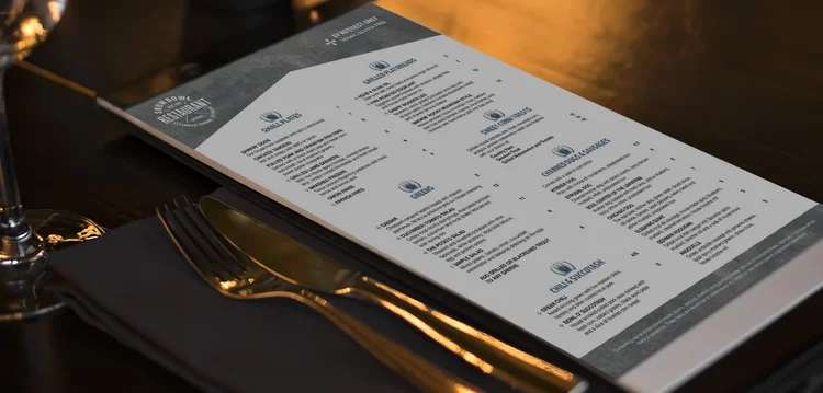
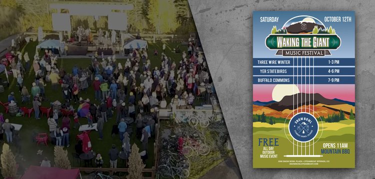
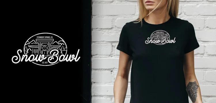
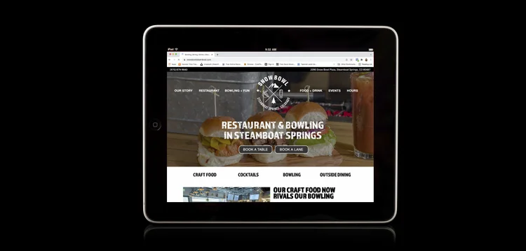
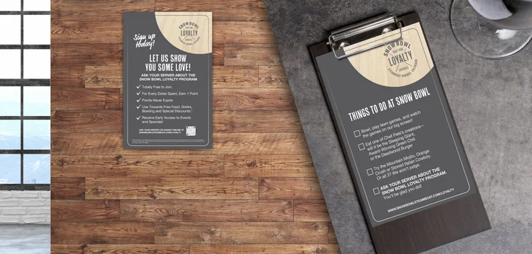
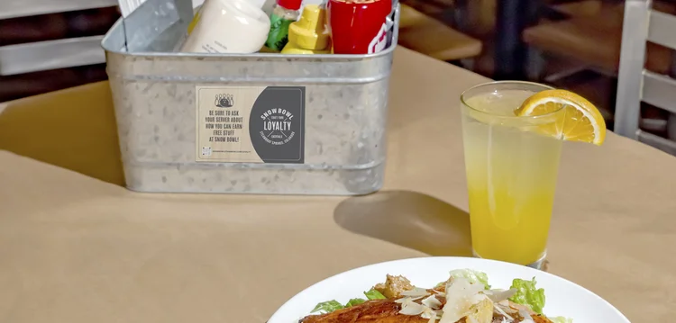
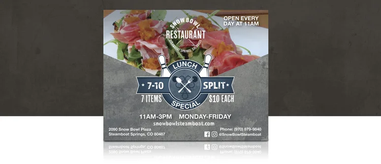
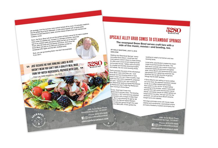
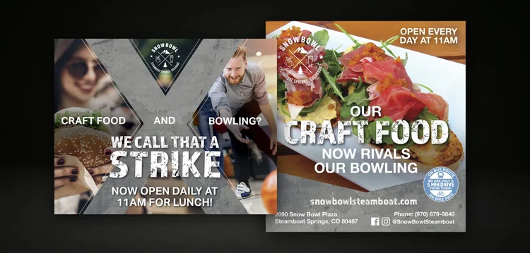
Snow Bowl is a restaurant and bowling alley in Steamboat Springs, Colorado that was completely renovated in 2018. With the much anticipated grand re-opening came a need for a complete rebrand. The immediate goal was to convince Steamboat that this was essentially a Cinderella story — the once divey bowling establishment with sub-par bar food had been transformed into a Steamboat destination with delicious, craft food and beautifully renovated bowling lanes. To get the word out, we made a huge push through local print advertisements, social media and also a grassroots approach by working with local hotels and tourism companies to spread the word. The main message was that Snow Bowl was on the map for not only bowling — but great craft food and cocktails! It’s a family destination, a destination for friends, for happy hour and for fun for everyone. We created everything from van wraps to promo cards to event posters — and everything in between.
Elevation Ketchup
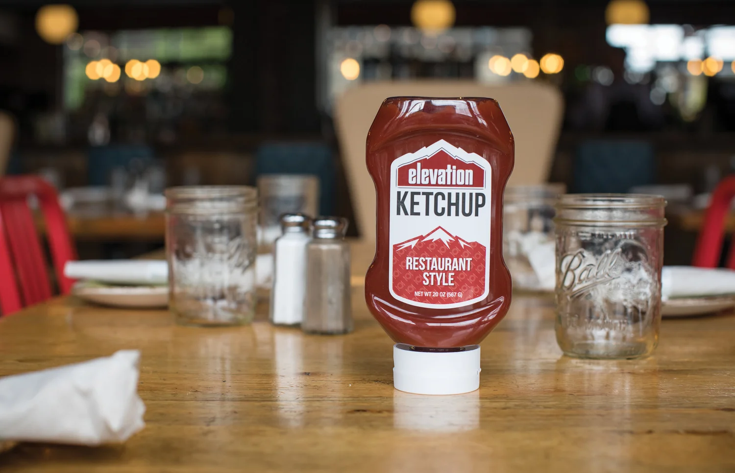
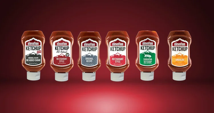
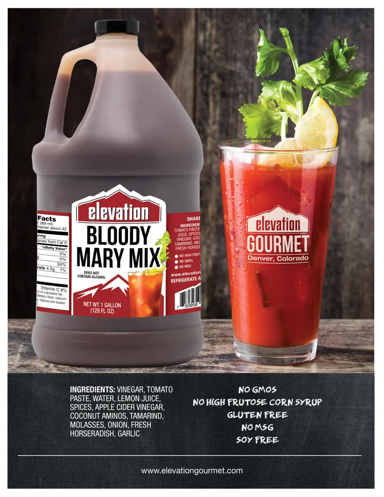
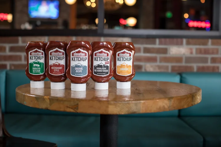
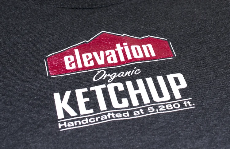
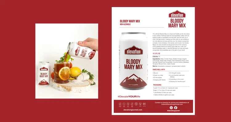
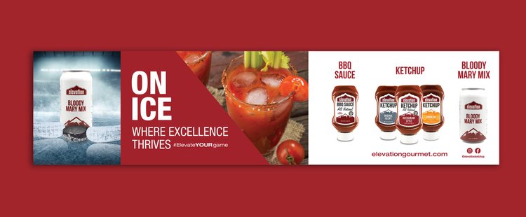
Elevation Organic Ketchup, a local product born and created in Denver, Colorado, needed a complete brand identity campaign including logo, package design and print/promotional materials that would speak to the spirit of the brand and its consumers. We developed a logo that visually alluded to Denver’s mountain region and 5,280 ft. elevation. In the original design during the company's launch, kraft-colored paper labels were printed to denote the hand-made nature of this unique ketchup. As time went on and production and efficiency needed to increase, we moved the main product line to one color silkscreen printed directly onto the glass bottles which saved time with labeling. Eventually, squeeze bottles were created for restaurant use as well as mini bottles. A secondary logo was developed for apparel use and embroidered onto patches giving the original ketchup branding a cooler, more hip feel for use on beanies, hats and backpacks. We provide all creative direction for the Elevation Organic Ketchup and Bloody Mary Mix brand and create all of the printed sales sheets, signage, retractable banners, etc. that are needed in promoting the company.
Merfs Condiments

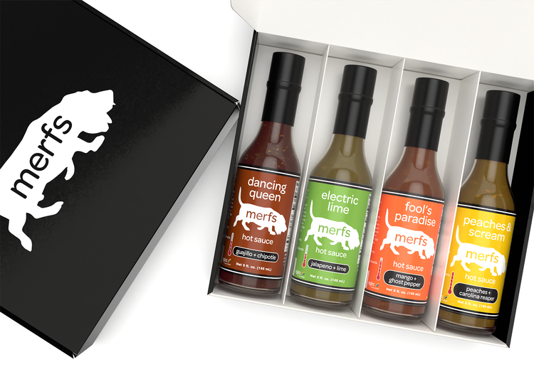
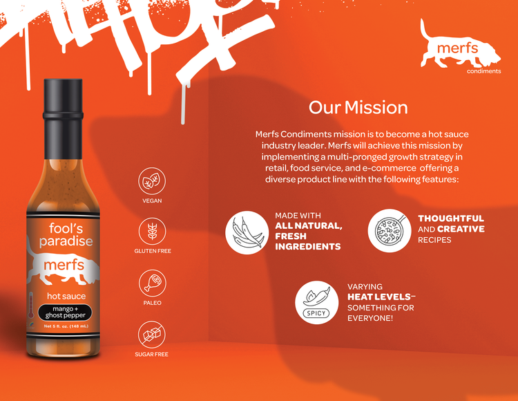
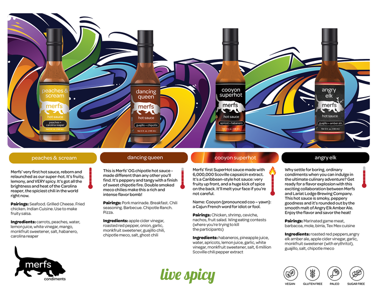
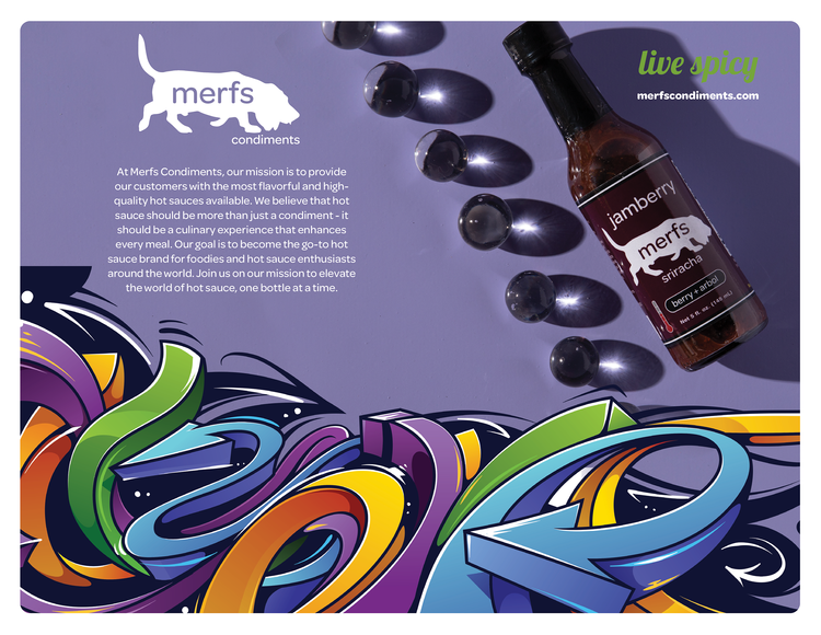
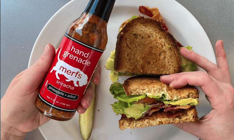
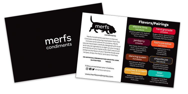
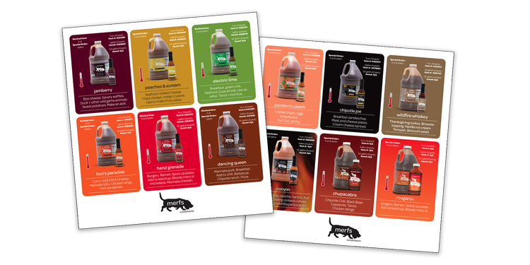
Merfs Condiments is a local-to-Denver hot sauce and condiment company that is thriving in Colorado. They produce a whole line of to-die-for hot sauces and a couple specialty mustards. We were happy to start helping them out recently with a colorful packaging overhaul. The company had already developed their whimsical, fantastic basset hound logo that is so unique to the brand. We then further developed their brand look and creative strategy by implementing bold, color coded labels to go along with the sauces vivid colors and help them stand out on the shelves. Other branded collateral elements were created including promotional stickers, retail signs, shelf talkers and a variety of product sales sheets.
April 2024 Update: Watch for Brink Design Studio’s feature of the Merfs product packaging design in The Best Sauce Packaging Designs section of Design Rush.
Anders' Vodka
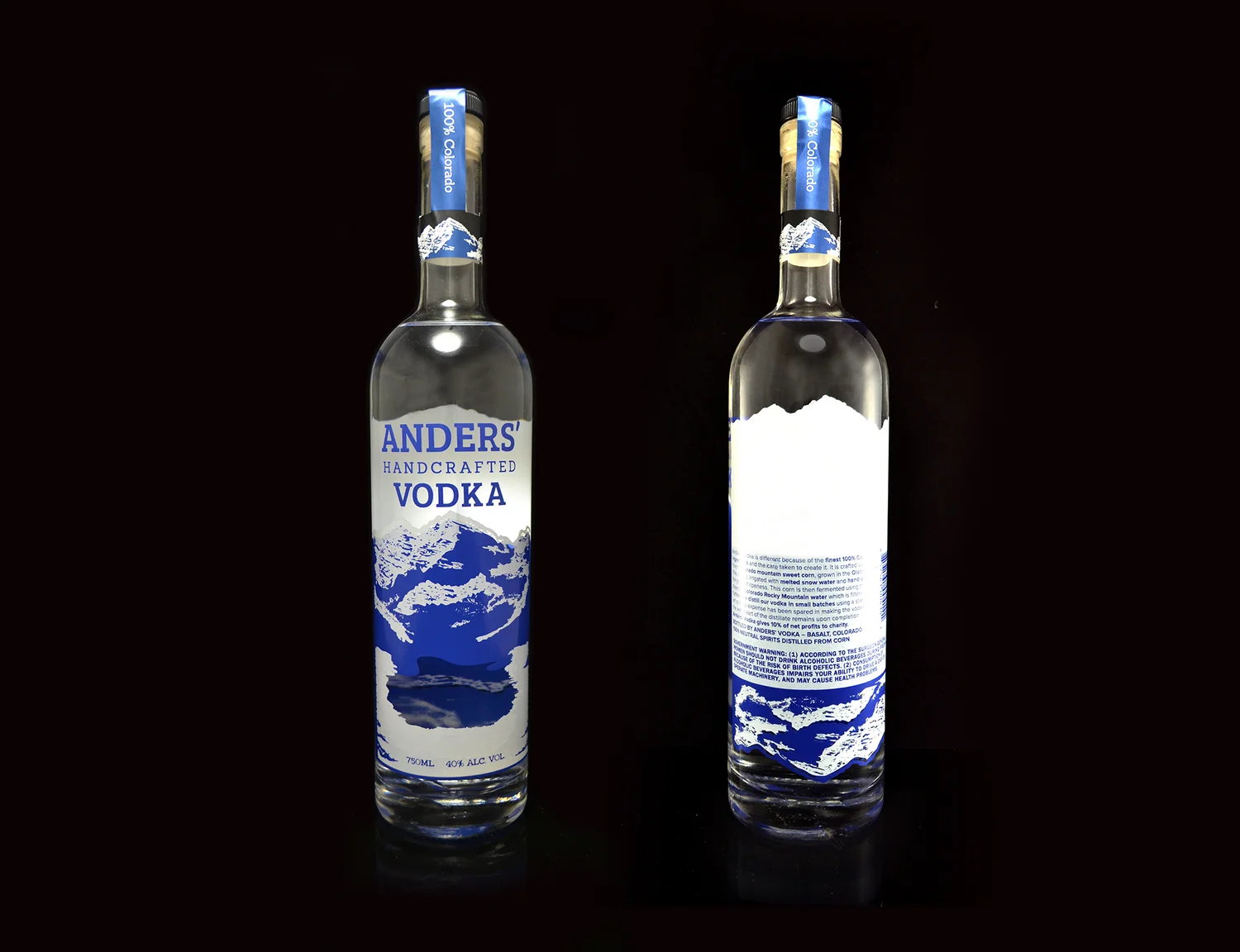
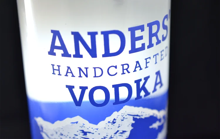
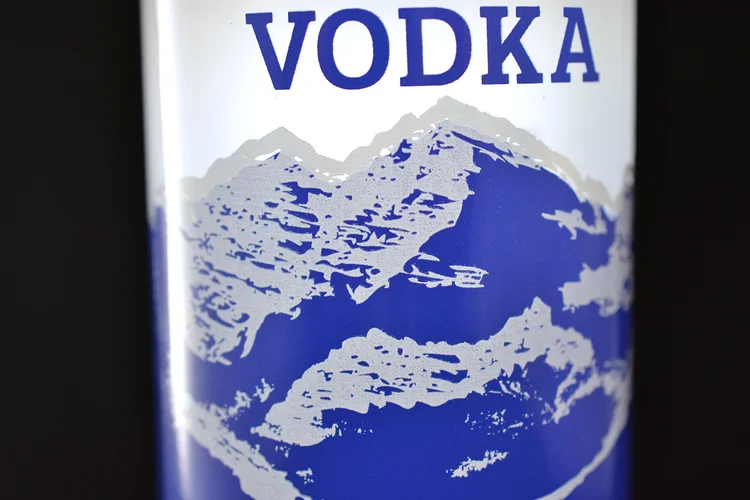
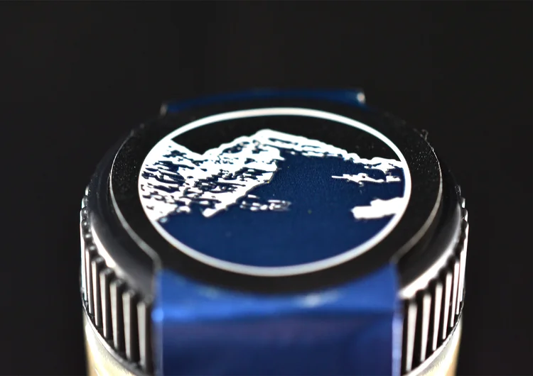
Anders' Vodka is a 100% Colorado grown, fermented, distilled, bottled and owned vodka. A redesign of the bottle’s packaging was needed that did not include a label application which the owner was finding too labor intensive in production. But they still needed a cost effective solution that stood out on the shelves next to the competition. We decided to silkscreen directly onto the glass in two colors: metallic blue and white. A silkscreened bottle gave Anders' Vodka its own unique presence next to other vodkas in retail. Other vodka packaging tends to either be printed labels or expensive frosted/custom glass and four color printing. So the uniqueness of this printing process in the category helped it stand out. There is a challenge with silk screen printing in that there is a lot of shift that can occur when laying down multiple colors. The complexity of the illustration requested of the Maroon Bells mountains required we take a lot of care and thought in setting up the colors to print one on top of the other, all while having the correct elements show through in the proper places on the glass. This turned out to be a design solution that was well received by liquor store owners and consumers.
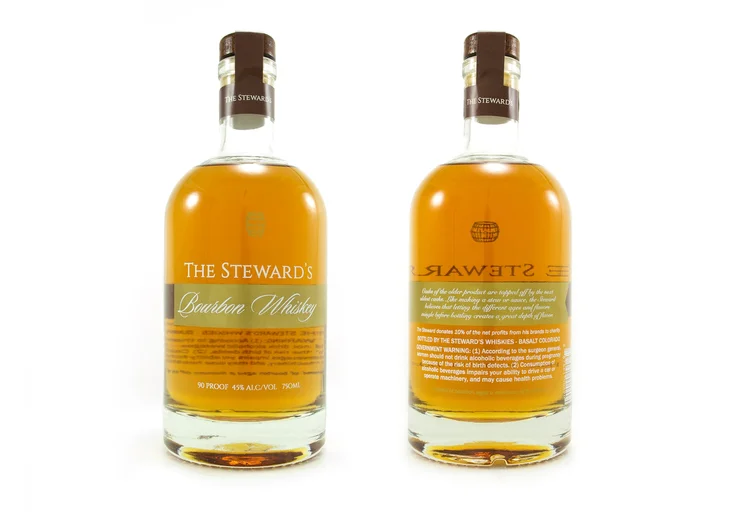
The Steward's Bourbon Whiskey
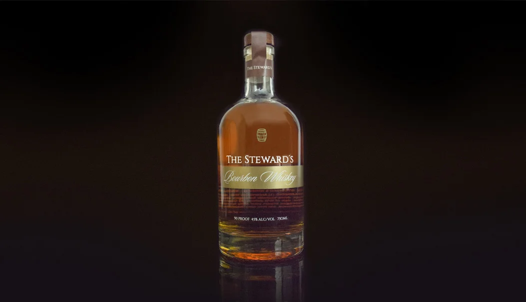
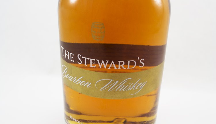
The Steward’s Bourbon Whiskey bottle design needed a clean, high-end feel. We used a two-color silkscreen printing process and wrapped a gold metallic ribbon from the front to the back of the bottle. This band held “Bourbon Whiskey” and descriptive copy on the back of the bottle. Additional touches like the gold metallic barrel emblem add an extra bit of elegance to the brand. The end result: a simple, upscale, elegant bottle that exudes presence on the shelf.
LINC Golf & Wellness
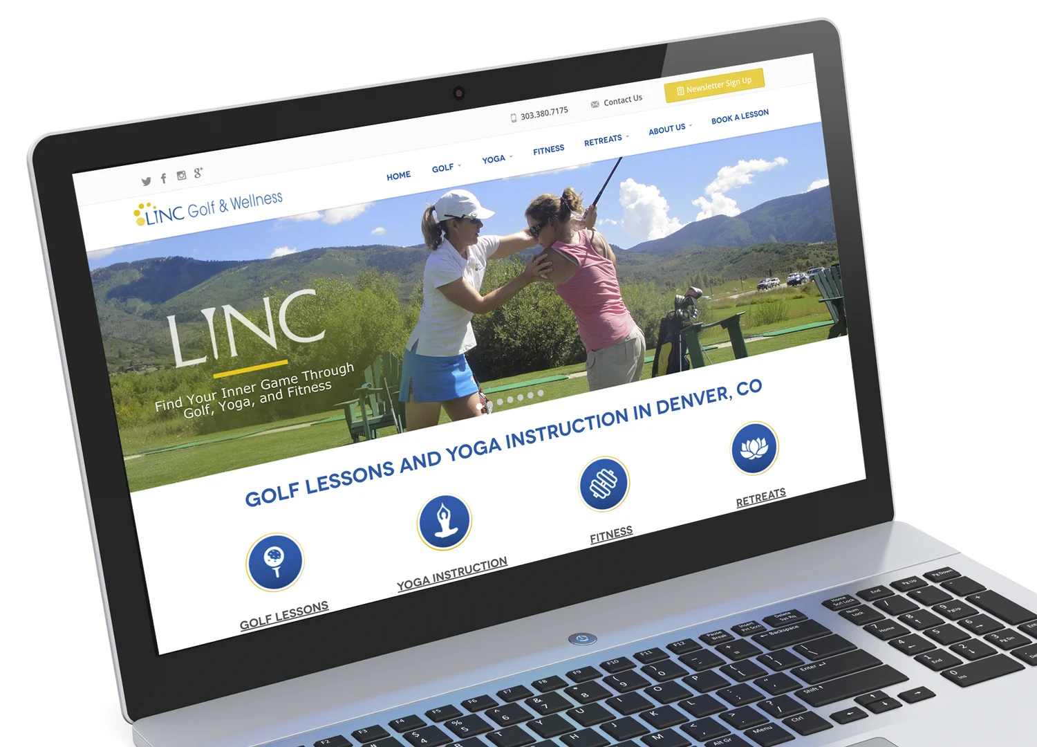
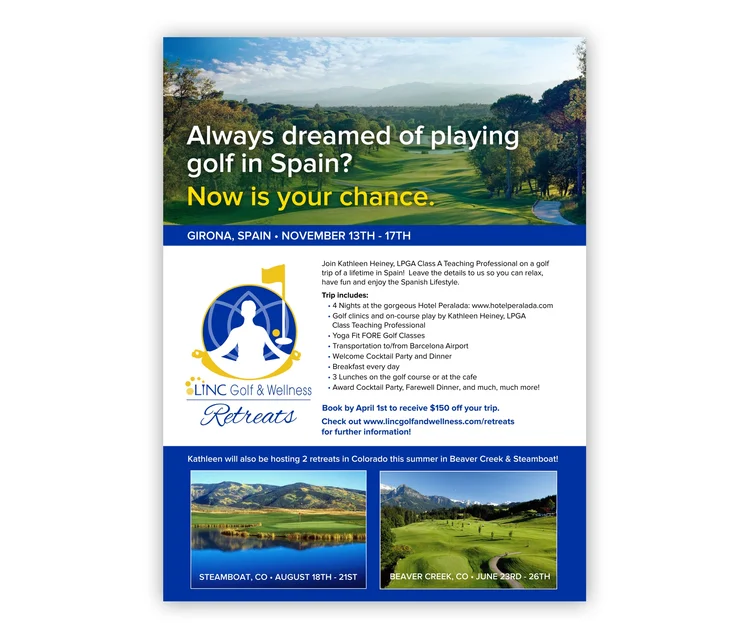
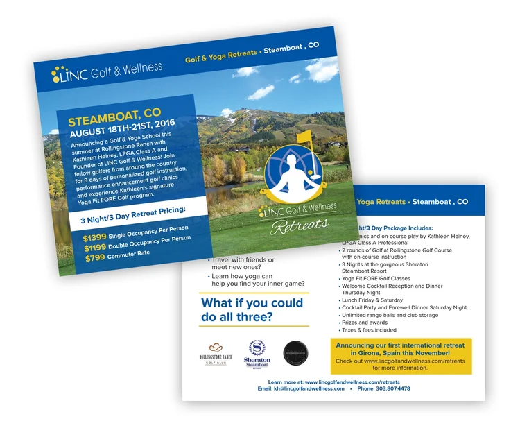
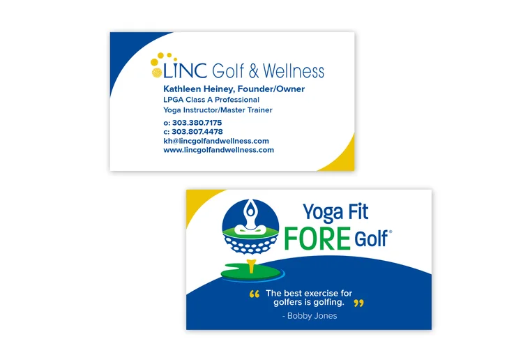
LINC Golf and Wellness provides an all-encompassing wellness and golf program through yoga, golf instruction and fitness development. Its specialty programs include Yoga Fit FORE Golf® and LINC Golf & Wellness Retreats. The owner came to us initially wanting a new, updated web site and look. From there, we continued to rebrand her company. We created both the LINC Golf & Wellness Retreats and Yoga Fit FORE Golf® logos as well as print collateral such as business cards, brochures, rack cards and a pitch deck for selling in Yoga Fit FORE Golf® to potential clients.

La Ishá Natural Skin Care
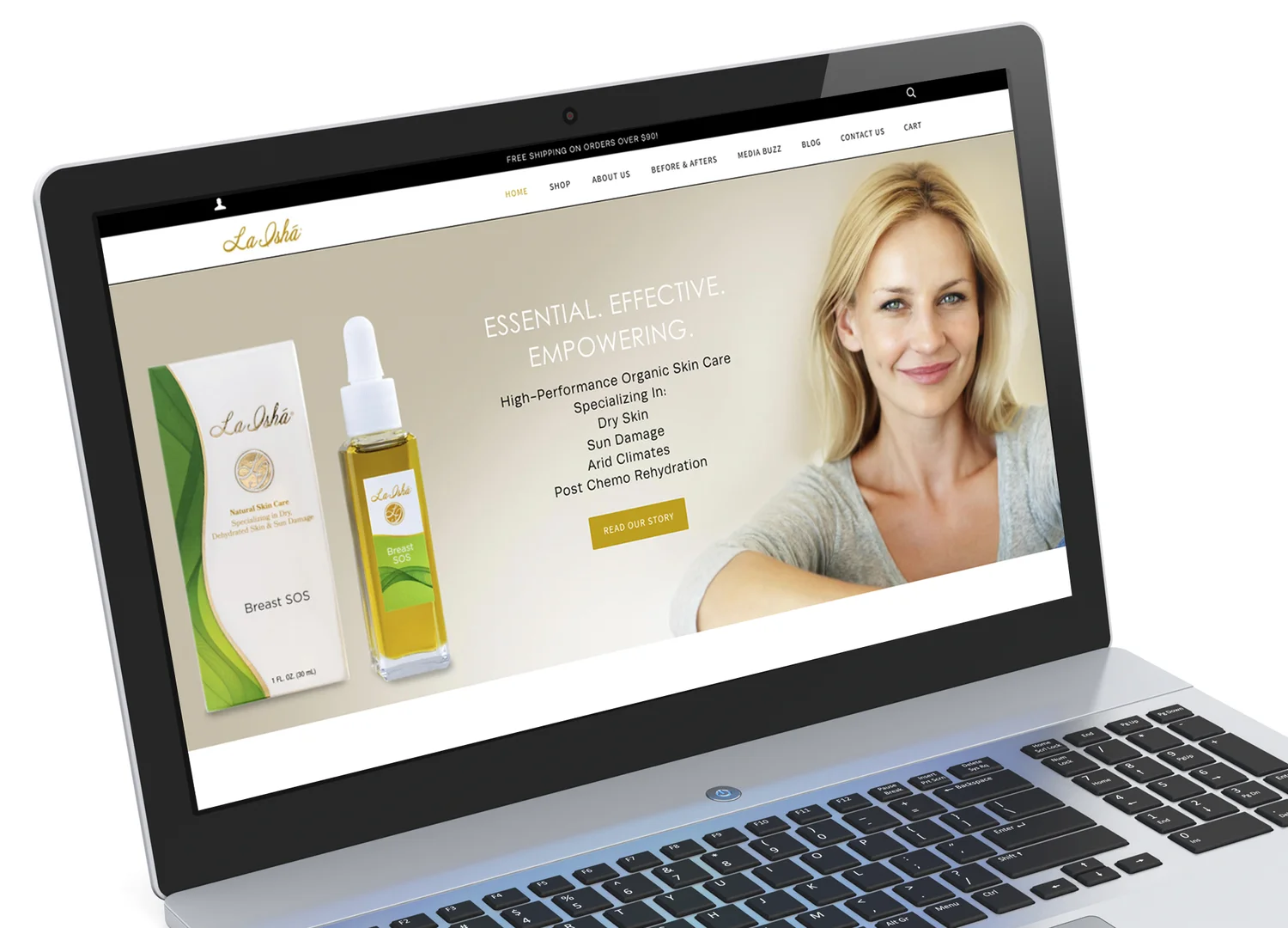
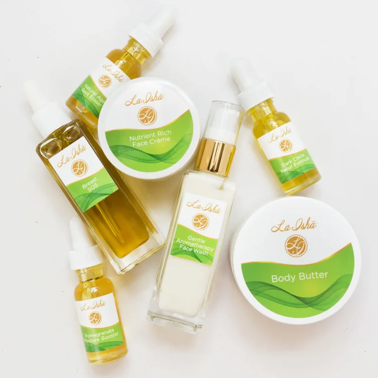
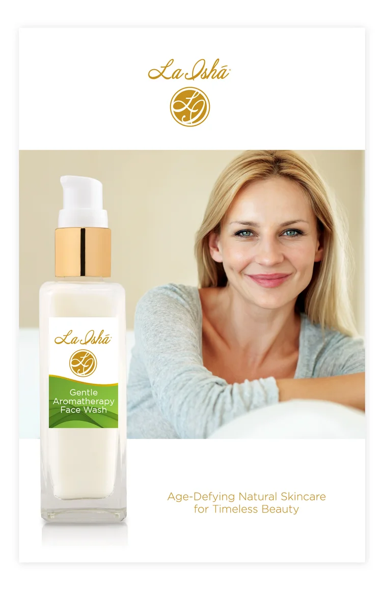
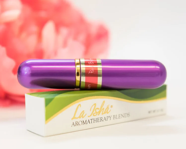
La Ishá Natural Skin Care is an all-natural line of anti-aging skin care and aromatherapy products that provides safe, yet effective skincare solutions. La Ishá came to us after being in business a number of years and wanted to change their original branding, starting with their website. They wanted to expand from the more home-grown, handmade look of their original site and packaging to the higher-end look of luxury and elegance that is present in the competitive world of skin care.
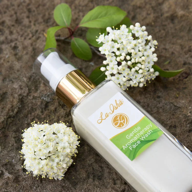
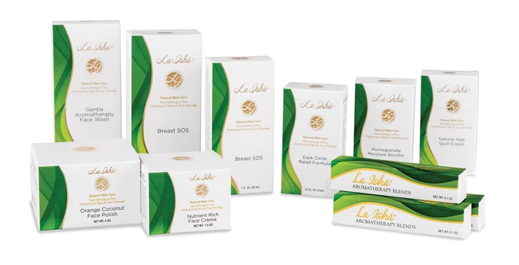
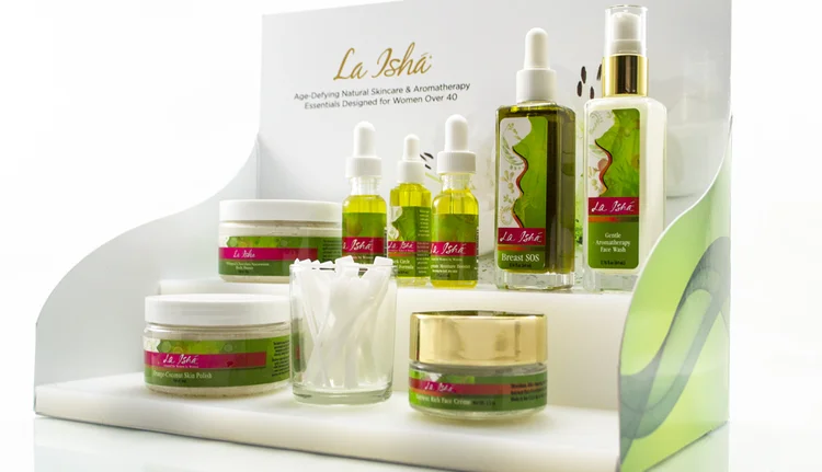
Our solution was to create more airy, elegant look for both the product boxes and labels. A green, curved border that wrapped around to the side panel was used as the common thread in the designs. It depicted the brand’s femininity and environmentally friendly ingredients. Gold foil stamping was used to add an extra touch of elegance and is reminiscent of the gold accents of the caps/pumps of the product containers. Creative direction was given on La Ishá's Shopify site to develop home page imagery that exuded luxury and created a consistent look with other branding. We also lent a hand in the art direction and set up of some Instagram shots for the social media platforms of the company. Armed with an iPhone as the camera and the creative insight to create a magazine look for the photos, we came up with some beautiful shots that told the story of the owner's social media posts.
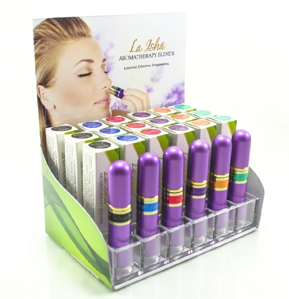
Cost-effective displays were designed for a select few shops that carry La Ishá's product. The low quantities that were needed called for creative thinking on how to print and deliver on budget. Over the years, we've developed brochures, ads and other print materials to continually reflect the spirit of this growing brand.

Biker Jim's Dogs
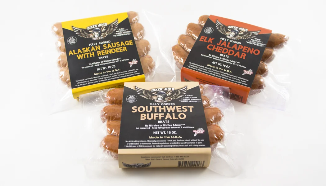
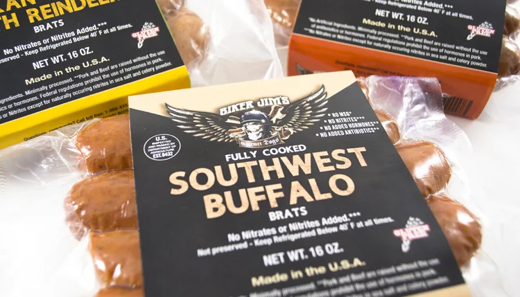
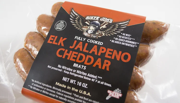
Biker Jim's Gourmet Dogs started selling gourmet wild game hot dogs in a food cart on the 16th Street Mall in Denver, Colorado, in 2005. With the success of this cart and his delicious dogs, he expanded the cart to a brick and mortar restaurant in downtown Denver and Highlands Ranch. These hot dogs were so good that people kept asking him if he sold them in retail stores—and so began our project of designing sausage packaging which portrayed his unique biker image. Starting with only the edgy, illustrated Biker Jim’s logo, we created a product line look for Biker Jim's Dogs multiple sausage flavors.
Chile Billy Sauces
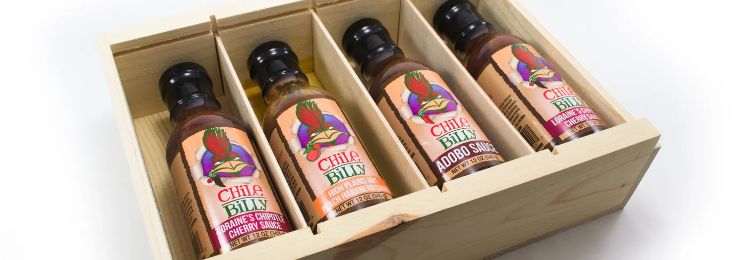
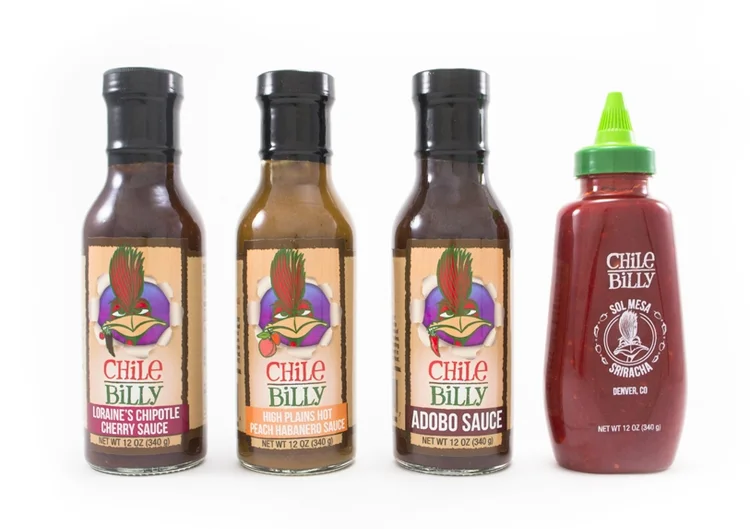
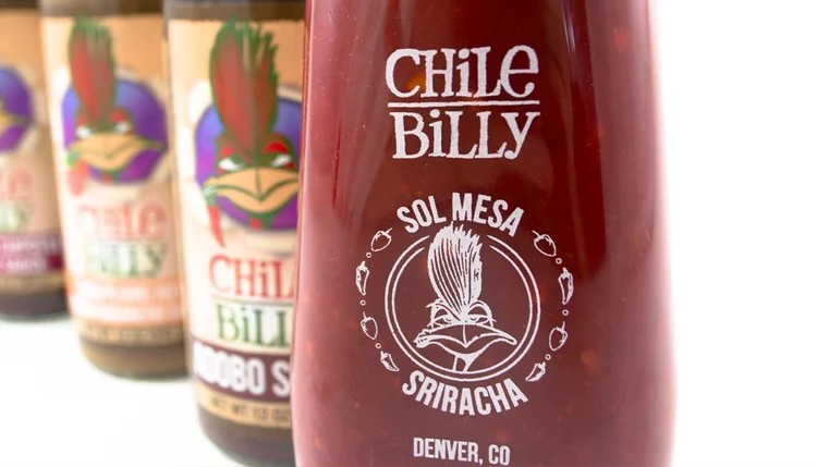
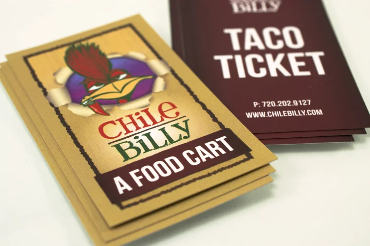
Chile Billy is a local food cart restauranteur in Denver, Colorado who has had great success with his Southwest and Mexican-inspired cuisine. One of the highlights of his taco food cart was his delicious home-made sauces and sriracha. He wanted to launch his line of sauces to be sold in retail stores and farmer’s markets so his customers could enjoy the taste they'd grown to love at home. His already existing playful logo depicting an illustrated road-runner gave us the creative license to create a fun, quirky product label. The unique custom die cut and rustic background represents the sauces' authenticity and Southwest culture. The road runner’s head — with primary sauce ingredient in mouth — 'pops through' the label as if he’s come right out of the chile farm.
Three Branches Brewery
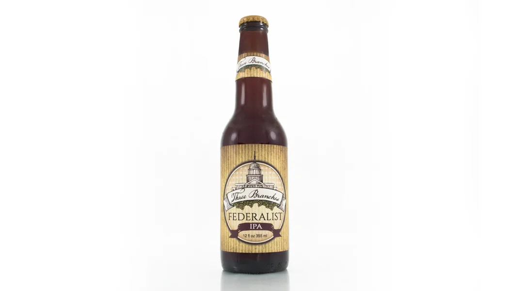
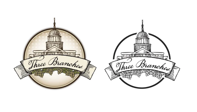
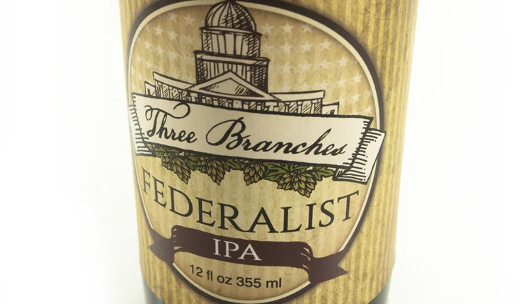
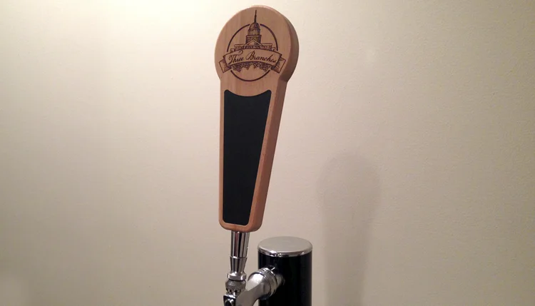
We produced this label for a family member who brews his own home beer. His passion for home brewing became a little more serious when he decided to enter his latest brew into a home brewing contest. For the contest, he developed the brewery name, Three Branches, representative of the three branches of US government. The first IPA produced under this brand was named “Federalist IPA.” We created a Three Branches logo and bottle label to use at the contest. We later turned the logo into a one-color treatment that was implemented onto a home tap handle design.