Anders' Vodka
Packaging design | branding
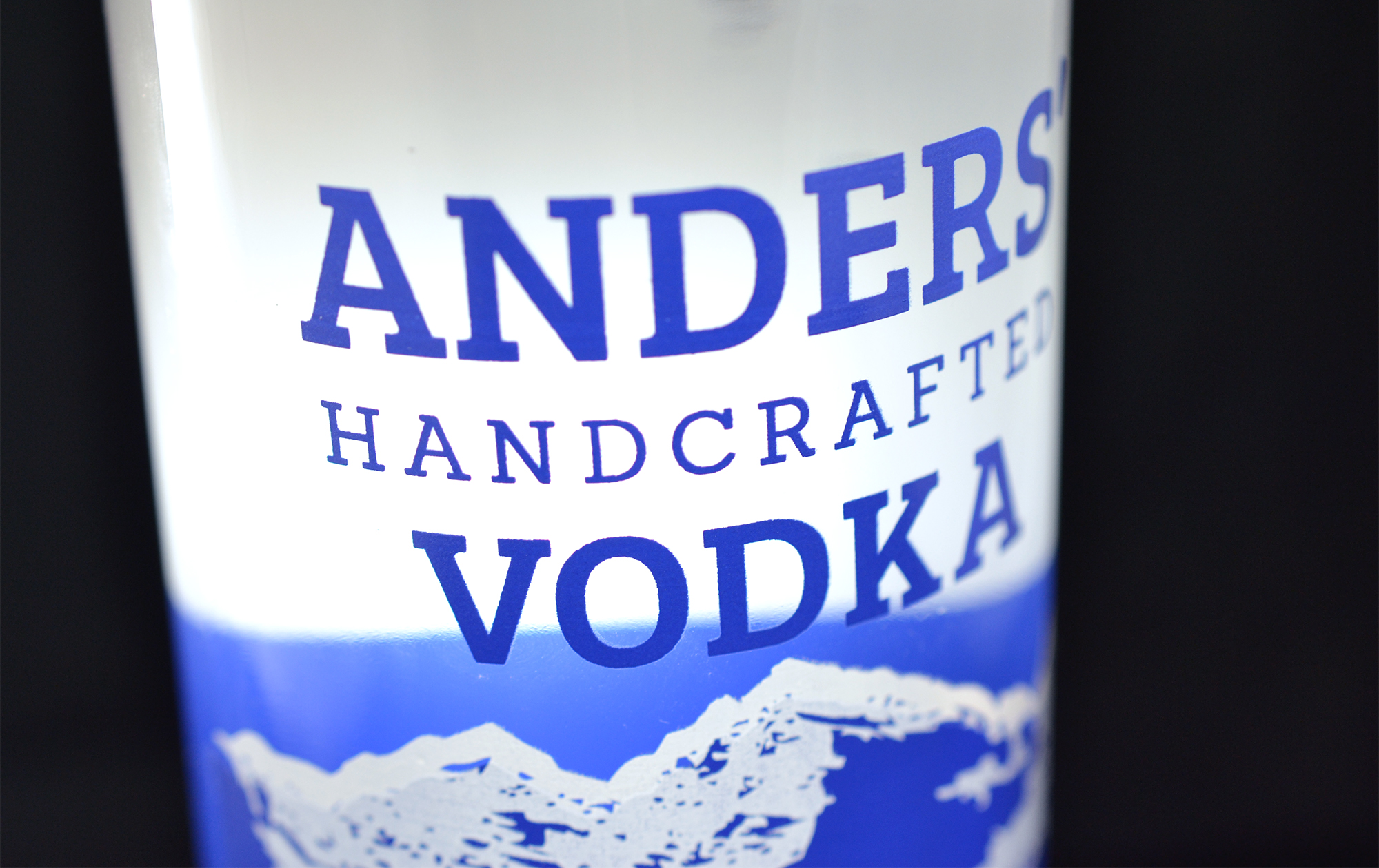
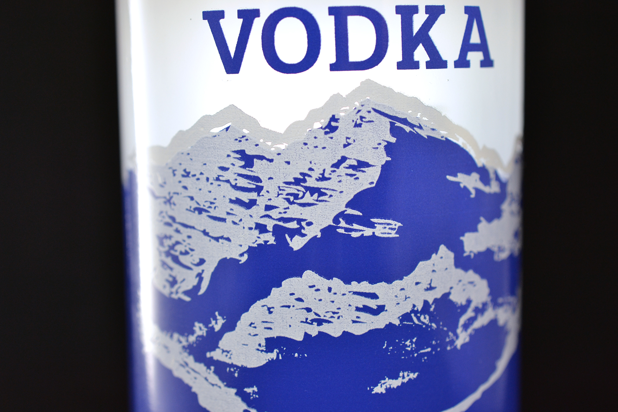
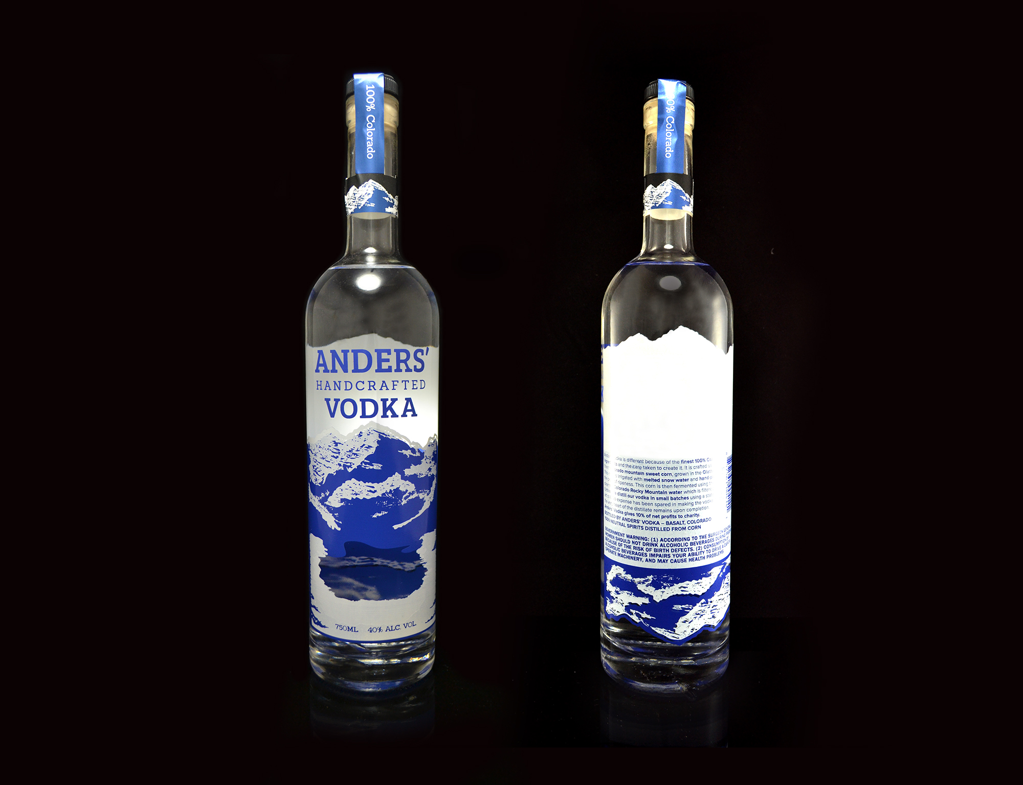
Anders' Vodka is a 100% Colorado grown, fermented, distilled, bottled and owned vodka. A redesign of the bottle’s packaging was needed that did not include a label application which the owner was finding too labor intensive in production. But they still needed a cost effective solution that stood out on the shelves next to the competition. We decided to silkscreen directly onto the glass in two colors: metallic blue and white. A silkscreened bottle gave Anders' Vodka its own unique presence next to other vodkas in retail. Other vodka packaging tends to either be printed labels or expensive frosted/custom glass and four color printing. So the uniqueness of this printing process in the category helped it stand out. There is a challenge with silk screen printing in that there is a lot of shift that can occur when laying down multiple colors. The complexity of the illustration requested of the Maroon Bells mountains required we take a lot of care and thought in setting up the colors to print one on top of the other, all while having the correct elements show through in the proper places on the glass. This turned out to be a design solution that was well received by liquor store owners and consumers.